以下是微信小程序自定义 TabBar 的实现方法:
1. 在 app.json 中配置 tabBar 为 custom:
```json
{
"tabBar": {
"custom": true,
"color": "#000000",
"selectedColor": "#1AAD19",
"backgroundColor": "#FFFFFF",
"borderStyle": "black",
"list": [
{
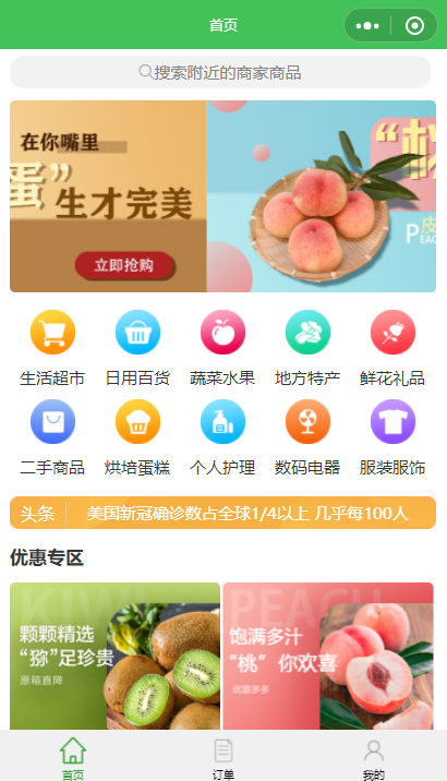
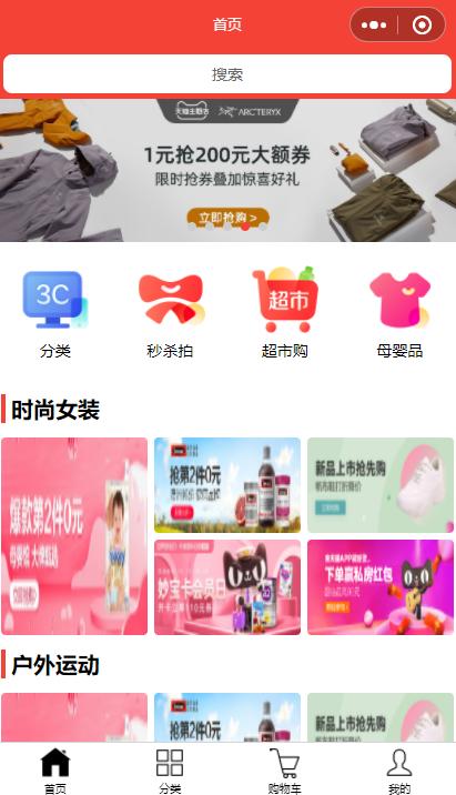
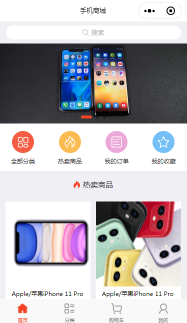
"pagePath": "pages/index/index",
"text": "首页",
"iconPath": "images/tabbar/home.png",
"selectedIconPath": "images/tabbar/home_active.png"
},
{
"pagePath": "pages/category/category",
"text": "分类",
"iconPath": "images/tabbar/category.png",
"selectedIconPath": "images/tabbar/category_active.png"
},
{
"pagePath": "pages/cart/cart",
"text": "购物车",
"iconPath": "images/tabbar/cart.png",
"selectedIconPath": "images/tabbar/cart_active.png"
},
{
"pagePath": "pages/mine/mine",
"text": "我的",
"iconPath": "images/tabbar/mine.png",
"selectedIconPath": "images/tabbar/mine_active.png"
}
]
}
}
```
2. 创建 custom-tab-bar 目录,包含以下文件:
custom-tab-bar.js:
```javascript
Component({
data: {
selected: 0,
color: "#000000",
selectedColor: "#1AAD19",
list: [
{
pagePath: "/pages/index/index",
text: "首页",
iconPath: "/images/tabbar/home.png",
selectedIconPath: "/images/tabbar/home_active.png"
},
{
pagePath: "/pages/category/category",
text: "分类",
iconPath: "/images/tabbar/category.png",
selectedIconPath: "/images/tabbar/category_active.png"
},
{
pagePath: "/pages/cart/cart",
text: "购物车",
iconPath: "/images/tabbar/cart.png",
selectedIconPath: "/images/tabbar/cart_active.png"
},
{
pagePath: "/pages/mine/mine",
text: "我的",
iconPath: "/images/tabbar/mine.png",
selectedIconPath: "/images/tabbar/mine_active.png"
}
]
},
methods: {
switchTab(e) {
const data = e.currentTarget.dataset
const url = data.path
wx.switchTab({url})
this.setData({
selected: data.index
})
}
},
lifetimes: {
attached() {
},
ready() {
}
}
})
```
custom-tab-bar.json:
```json
{
"component": true,
"usingComponents": {}
}
```
custom-tab-bar.wxml:
```html
下一篇:setData性能问题如何优化