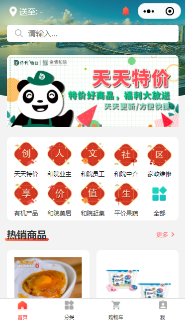
首先来看一下页面演示效果,页面中有下方标签栏是自定义 tabBar。自定义 tabBar 可以让开发者更加灵活地设置 tabBar 样式,以满足更多个性化的场景。
在此案例中,用到的主要知识点如下:
首先来实现 tabBar 标签栏,自定义 tabBar 可分为 3 大步骤,分别是:
在 app.json 中的 tabBar 项指定 custom 字段,同时其余 tabBar 相关配置也补充完整。所有 tab 页的 json 里需声明 usingComponents 项,也可以在 app.json 全局开启。
app.json
{
  "tabBar": {
    "custom": true,
    "list": [{
      "pagePath": "pages/home/home",
      "text": "首页",
      "iconPath": "/images/home.png",
      "selectedIconPath": "/images/home-active.png"
    },{
      "pagePath": "pages/message/message",
      "text": "消息",
      "iconPath": "/images/message.png",
      "selectedIconPath": "/images/message-active.png"
    },{
      "pagePath": "pages/contact/contact",
      "text": "联系我们",
      "iconPath": "/images/contact.png",
      "selectedIconPath": "/images/contact-active.png"
    }]
  },
}
注意:当配置自定义 tarBar 页面时,list 属性不能删除,为了保证低版本兼容以及区分哪些页面是 tab 页,tabBar 的相关配置项需完整声明,但这些字段不会作用于自定义 tabBar 的渲染。
注意:此处path不写最前面的 /
在代码根目录下添加入口文件,这里的文件夹名一定是 custom-tab-bar,然后在创建 index 组件(index命名也不能随便改,就用 index,否则无法识别)。
当 custom 参数为 true 时,小程序就会自动识别 custom-tab-bar 里面的文件,并将其渲染出来。
用自定义组件的方式编写即可,该自定义组件完全接管 tabBar 的渲染。另外,自定义组件新增 getTabBar 接口,可获取当前页面下的自定义 tabBar 组件实例。这里使用 Vant Weapp 底部导航栏,用于在不同页面之间进行切换。
1、引入
在 app.json 或 index.json 中引入组件,这里对组件进行全局引用,具体代码如下所示:
app.json
{
  "usingComponents":{
    "my-test1": "/components/test1/test1",
    "my-test2": "/components/test2/test2",
    "my-test3": "/components/test3/test3",
    "my-test4": "/components/test4/test4",
    "my-test5": "/components/test5/test5",
    "van-button": "@vant/weapp/button/index",
    "my-numbers": "./components/numbers/numbers",
    "van-tabbar": "@vant/weapp/tabbar/index",
    "van-tabbar-item": "@vant/weapp/tabbar-item/index"
  },
}
2、基础用法
index.wxml
<van-tabbar active="{{ active }}" bind:change="onChange">
  <van-tabbar-item icon="home-o">标签van-tabbar-item>
  <van-tabbar-item icon="search">标签van-tabbar-item>
  <van-tabbar-item icon="friends-o">标签van-tabbar-item>
  <van-tabbar-item icon="setting-o">标签van-tabbar-item>
van-tabbar>
index.js
Component({
  /**
   * 组件的初始数据
   */
  data: {
    active: 0,
  },
  /**
   * 组件的方法列表
   */
  methods: {
    onChange(event) {
      // event.detail 的值为当前选中项的索引
      this.setData({ active: event.detail });
    },
  }
})
3、自定义图标
知道怎么引用 Vant 组件之后,接下来就根据需求来对其进行修改,可以通过 slot 自定义图标,其中 icon slot 代表未选中状态下的图标,icon-active slot 代表选中状态下的图标。来看一下 vant 提供的参数 TabbarItem Slot:
| 名称 | 说明 |
|---|---|
| icon | 未选中时的图标 |
| icon-active | 选中时的图标 |
index.wxml
通过 wx: for 将标签栏渲染到页面上。
<van-tabbar active="{{active}}" bind:change="onChange">
  <van-tabbar-item wx:for="{{list}}" wx:key="index">
    <image
      slot="icon"
      src="{{ item.iconPath }}"
      mode="aspectFit"
      style="width: 25px; height: 25px;"
    />
    <image
      slot="icon-active"
      src="{{ item.selectedIconPath }}"
      mode="aspectFit"
      style="width: 25px; height: 25px;"
    />
    {{item.text}}
  van-tabbar-item>
van-tabbar>
index.js
将 app.json 里的 list 数组放在自定义 tabBar 组件中的 data 数据,然后通过循环渲染到页面上。
注意:此处path必须加前面的/,否则在切换tabbar时,会自动拼接地址,导致传入url有误,系统没有任何效果
Component({
  /**
   * 组件的初始数据
   */
  data: {
    active: 0,
    "list": [{
      "pagePath": "/pages/home/home",  //复制过来,记得加 /
      "text": "首页",
      "iconPath": "/images/home.png",
      "selectedIconPath": "/images/home-active.png"
    },{
      "pagePath": "/pages/message/message",
      "text": "消息",
      "iconPath": "/images/message.png",
      "selectedIconPath": "/images/message-active.png"
    },{
      "pagePath": "/pages/contact/contact",
      "text": "联系我们",
      "iconPath": "/images/contact.png",
      "selectedIconPath": "/images/contact-active.png"
    }]
  },

  /**
   * 组件的方法列表
   */
  methods: {
    onChange(event) {
      // event.detail 的值为当前选中项的索引
      this.setData({ active: event.detail });
    },
  }
})
此时可以看到已经成功把 list 数组里的图片都渲染出来了
详细步骤,可以参考小程序官方给出的 文档 。
通过 van-tabbar-item 上 info 属性可以对 tabBar 渲染数字,具体代码如下所示:
index.wxml
<van-tabbar active="{{active}}" bind:change="onChange">
  <van-tabbar-item wx:for="{{list}}" wx:key="index" info="2">
    <image
      slot="icon"
      src="{{ item.iconPath }}"
      mode="aspectFit"
      style="width: 25px; height: 25px;"
    />
    <image
      slot="icon-active"
      src="{{ item.selectedIconPath }}"
      mode="aspectFit"
      style="width: 25px; height: 25px;"
    />
    {{item.text}}
  van-tabbar-item>
van-tabbar>
可以看当对 tabBar 加上数字徽标时,就溢出 tabBar 页面范围。此时需要美化 tabBar 页面, 通过调试器可以看到,图标与标签名中间有间隔。
在网页开发中,橘黄色的部分代表 margin 。
从上图可以发现,margin-bottom: var(--tabbar-item-margin-bottom,5px);,其中 var 是css中用来引用变量的,当 --tabbar-item-margin-bottom 不存在的时候,就默认为 5px。所以只要重置其 margin-bottom 的值,数字徽标就不会超出 tabBar 范围。
index.wxss
.van-tabbar-item{
  --tabbar-item-margin-bottom: 0,
}
注意:在自定义组件中使用 Vant Weapp 组件时,需开启 styleIsolation: ‘shared’ 选项
index.js
Component({
  options: {
    styleIsolation: "shared",
  },
});
在实际开发过程中,并不是所以图标都需要添加数字徽标的,所以不能 info 属性将其写死。这里需要把 store 里面的数据绑定组件中进行使用,然后通过数据监听器将数据变化传到数字图标上,具体代码如下所示:
index.wxml
通过判断是否有 info 属性来显示该数字图标,当 info 属性不存在或者为 0 的时候都不显示。
<van-tabbar active="{{active}}" bind:change="onChange">
  <van-tabbar-item wx:for="{{list}}" wx:key="index" info="{{item.info ? item.info : ""}}">
    <image
      slot="icon"
      src="{{ item.iconPath }}"
      mode="aspectFit"
      style="width: 25px; height: 25px;"
    />
    <image
      slot="icon-active"
      src="{{ item.selectedIconPath }}"
      mode="aspectFit"
      style="width: 25px; height: 25px;"
    />
    {{item.text}}
  van-tabbar-item>
van-tabbar>
index.js
在消息图标后添加 info 属性。
// custom-tab-bar/index.js
// 导入
import {storeBindingsBehavior} from "mobx-miniprogram-bindings"
import {store} from "../store/store"

Component({
  // 挂载
  behaviors: [storeBindingsBehavior],
  // 全局数据操作
  storeBindings: {
    store,
    fields:{
      sum: "sum"
    },
    actions: {}
  },

  // 数据监听
  observers:{
    "sum": function (value){
      this.setData({
        "list[1].info": value
      })
    }
  },
  /**
   * 组件的初始数据
   */
  data: {
    active: 0,
    "list": [{
      "pagePath": "pages/home/home",
      "text": "首页",
      "iconPath": "/images/home.png",
      "selectedIconPath": "/images/home-active.png"
    },{
      "pagePath": "pages/message/message",
      "text": "消息",
      "iconPath": "/images/message.png",
      "selectedIconPath": "/images/message-active.png",
      info: 2
    },{
      "pagePath": "pages/contact/contact",
      "text": "联系夜阑",
      "iconPath": "/images/contact.png",
      "selectedIconPath": "/images/contact-active.png"
    }]
  },
})
可以看到对全局数据进行操作时,消息的数字徽标也会随着变化
通过监听 tabBar 的 change 事件,得到当前选中项的索引,根据这个索引找到对应页面路径,最后用 wx.switchTab 进行页面跳转。
store.js
不用在组件data 里面定义选中项的索引,不然会出现问题(坑点),最好定义在 store 中,先在 store 定义变量和修改方法。
export const store